The Visualization Picker (or Toolbox) on the left-hand side of the workspace features dozens of visualizations, offering users tremendous flexibility in the visualization of data.
By default, visualizations are drawn using Smart Discover's Auto Recommend feature. This option uses an AI-driven Smart Visualization engine to plot the data using the most appropriate visual with the most appropriate data layout given your data selections. You can, however, override this selection either by making manual selections from the left-hand Toolbox or by choosing from the alternative visualizations from the Auto Recommended panel.
Smart Visualizations
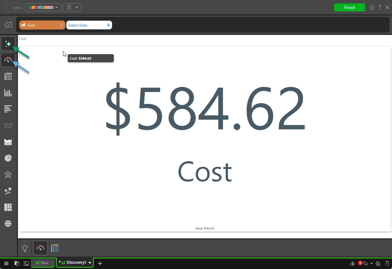
The Auto Recommend option (green arrow below) is located at the top of the Visualization Picker and is enabled by default. While enabled, Pyramid uses the AI-driven Smart Visualization engine to automatically select and draw a visual for the data you have selected.
When a single measure is added, Auto Recommend typically selects a Gauge as the visualization type (blue arrow):
If you add a Dimension to your visual (by clicking Select Data and choosing a Dimension), the selected visualization type automatically changes (note the blue arrow below):
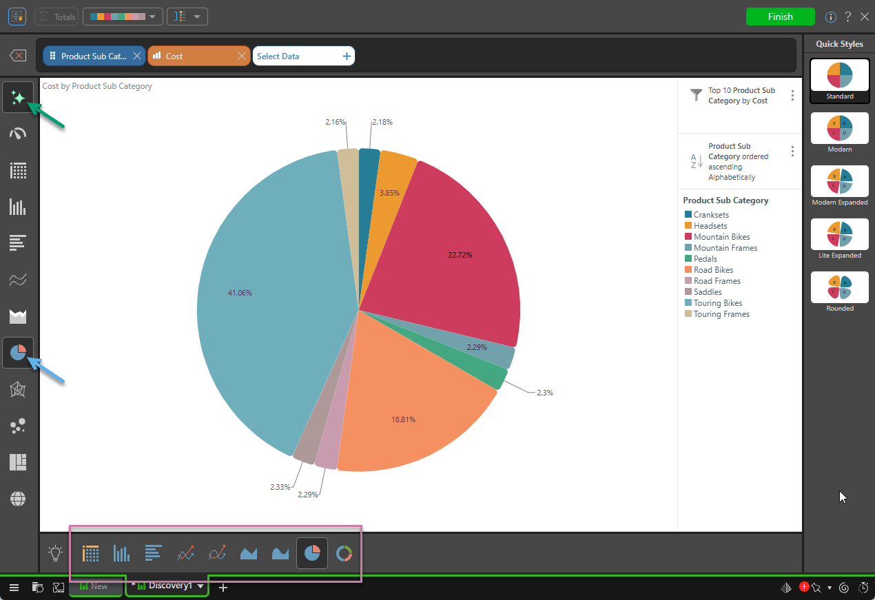
Tip: Pyramid offers you alternative Auto Recommended options along the bottom of the page (purple highlight above). For more information about the mechanics of this behavior, see Smart Visualization Mechanics.
Overriding the Visualization Type
If the visualization type does not satisfy your requirements, you can override the Auto Recommended choice using one of these options:
- If you require a specific visualization type, you can use the Visualization Picker to manually override the Auto Recommended setting.
- If you want to select an alternative visualization type but still rely on options chosen by Pyramid based on your data, you can choose one of the Auto Recommended options from the bottom panel (purple highlight above).
Visualization Picker
To select one of the options that Pyramid has not recommended:
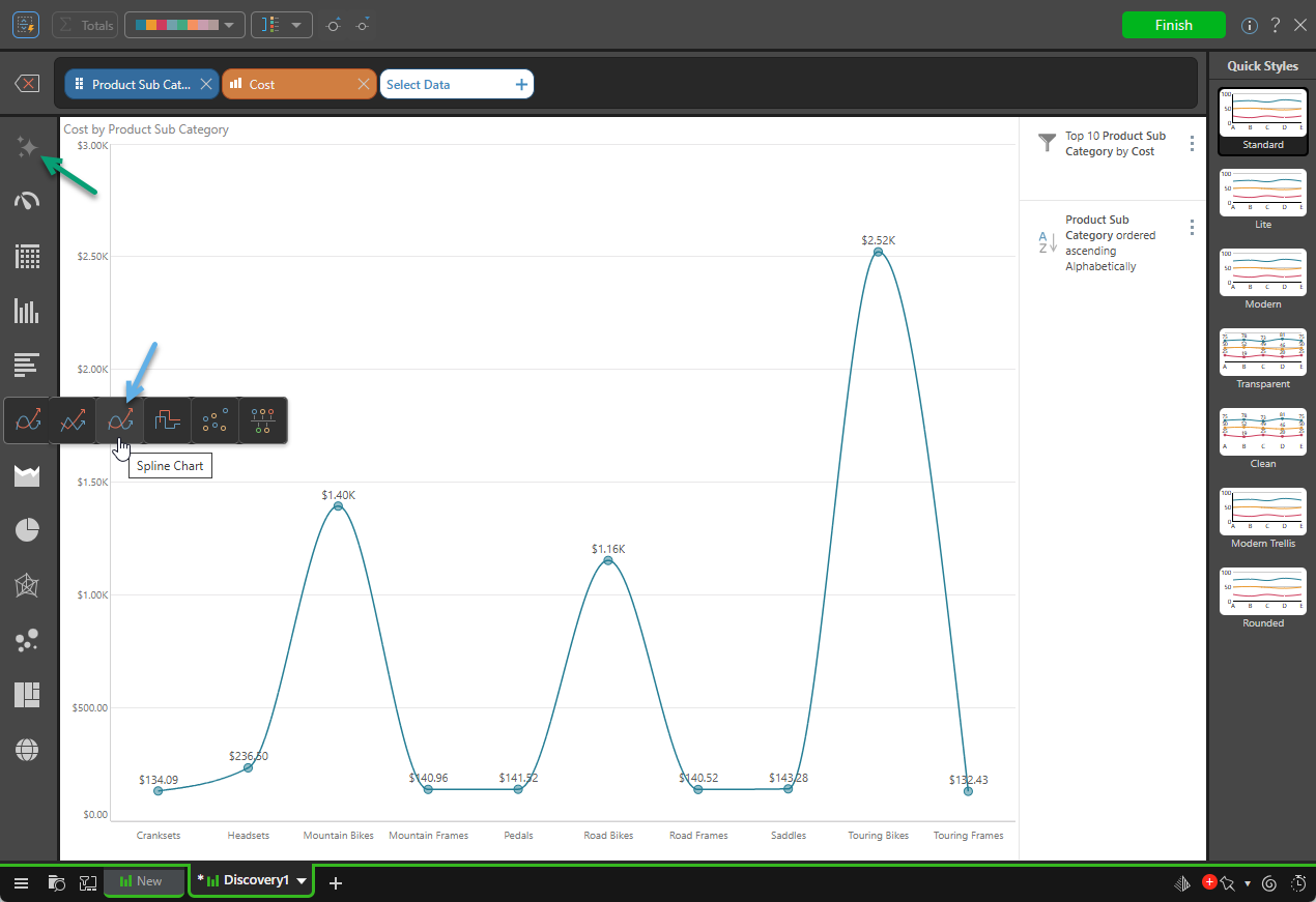
- The Visualization Picker has a submenu structure; for example, right-click Line Chart to open the submenu, where you can select Spline Chart (blue arrow below).
- When you select an option manually, the Auto Recommend button is disabled (green arrow) and the Auto Recommended panel is no longer shown at the bottom of the page.
- Click here for more information
Auto Recommended Panel
The Auto Recommended panel is only available while the Auto Recommend option is selected. If recommendations are not currently shown, and you want to select a recommendation:
- Re-enable the Auto Recommend option (green arrow above).
- Select one of the visualization types from the Auto Recommended panel at the bottom of the canvas.
The visualization is redrawn in response to this selection and the Auto Recommended panel is shown again.
- Click here for more information
Available visualization types
The following list shows the visualization types that are available in Discover, click the link to see more information about each type in the main Discover Pro help.
Note: The following list is annotated to indicate any visualization types that are not relevant to Smart Discover. Should you wish to use a visualization type that is not available in Smart Discover, you should click Finish, save your discovery, and then re-open it in Discover Lite or Pro to make your changes.
KPI charts
KPI charts are used to visualize your KPIs as a gauge or bullet chart. You can typically choose from two KPI chart types:
- Gauges
- Bullet chart (Discover Pro only.)
Grids
Grids are used to present data in rows and columns. You can typically choose from three grid types:
- Matrix Grid
- Tabular Grid
- Raw Grid (Discover Pro only.)
Cartesian charts
Cartesian charts plot data across two axes (a y-axis and an x-axis), which meet at 0.
Column charts
Not available in Smart Discover (Discover Pro and Lite only):
Bar charts
Line charts
- Line chart
- Spline chart
- Step line chart
- Point chart
- Lollipop chart
- IBCS-like line chart (Not Smart Discover)
- IBCS-like lollipop chart (Not Smart Discover)
Area charts
- Area chart
- Stacked area chart
- Stacked 100% area chart
- Stream area chart
- IBCS-like area chart (Not Smart Discover)
Segment charts
Segment Charts display each element of the given hierarchy as a different segment of the chart, with each element represented as a proportion of the whole, based on its value.
Radar charts
Radar charts are used to plot one or more series of values across multiple quantitative variables, which are represented on axes extending from a central point.
- Radar line chart
- Radar area chart
- Radar smooth line chart
- Radar area smooth line chart
- Radar point chart
Plotted Charts
Plotted Charts (or Multi-Variable charts) plot two hierarchies across Cartesian coordinates. They are useful in finding correlations in the data set.
Advanced Charts
Advanced Charts plot multiple hierarchies in ways that can be more interesting than a typical Cartesian chart.
- Tree Map Chart
- Hierarchical Tree Map Chart
- Circle Packing Chart
- Hierarchical Circle Packing Chart
- Sankey Chart
- Word Cloud
- Sunburst Chart
Maps
Maps plot data geographically and are an excellent way to visualize the spread of data across geographical locations.
Disable Auto Recommend
Either click Auto Recommend to deselect and disable it or select a different visualization type from the left-hand Toolbox. (Selecting your own visualization type from the Toolbox manually also disables Auto Recommend.)
When you want to use the automated suggestions again, including to select recommended visualization types, click the Auto Recommend button again.